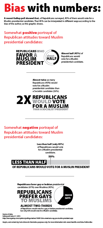
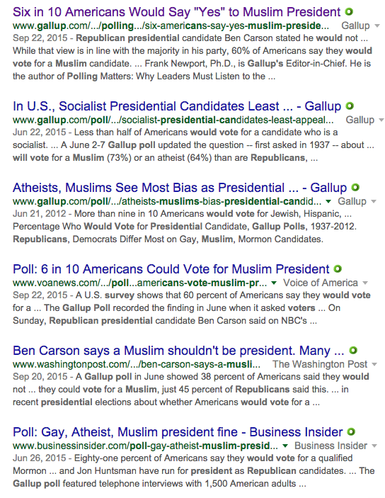
In case you missed it, last month there was quite a bit of discussion around a Gallup poll finding that only 45 percent of Republican respondents would support a presidential candidate who was Muslim. My characterization, as you might have guessed by now, was intentionally biased to illustrate the practice of twisting headlines and findings to fuel editorial and political slants. The screen capture below gives you a sense of how some outlets reported the poll results.
And just yesterday I read an excellent post by Slate’s David Auerbach on why we’ll never win the gun control debate with statistics. There was also the reporting on a gun study that went seriously awry a few weeks ago when news outlets mistakenly reported the findings to show that universal background checks on gun buyers don’t work. And don’t forget about that awesome Planned Parenthood graphic (I refuse to link to it) that showed (and I mean that in the loosest sense of the word—as in, my-6-year-old-just-drew-an-“x”-with-a-broken-crayon-and-called-it-a-chart type of “showed”)—abortions up and life-saving procedures down.
Those are just a few recent examples (regardless of how you feel about guns or Planned Parenthood), that illustrate how challenging it is for the casual reader to get unbiased reporting when it comes to statistics. But this this time I couldn’t stop myself from having a little fun with the Gallup poll by designing an infographic to illustrate the findings of Republicans toward Muslims in different ways. Enjoy. Or weep.