DC Metro Closures June 2016 – May 2017 Infographic

September 14, 2016By carlanews

DC Metro Safetrack closures and Capital Bikeshare options for June 2016-May 2017 (rev. September 14, 2016)

[Updated Sept 14, 2016. Click on the graphic for a full-size render.]

Why this graphic?

If you live in or near the District of Columbia, you are plagued by the quirky, antiquated subway system that chugs along like the well-meaning and mildly embarrassing relative that everyone tolerates and continues inviting to family functions.

On May 6, the Washington Post graphics team made a great interactive page detailing the Metro closures. I thought I’d mess around with the opening graphic for fun. I’ve since updated (several times) to show Capital Bikeshare stations at or near each affected station (2 blocks or closer) and to reflect the latest changes to the schedule from WMATA.

And if you choose to bike, PLEASE WEAR A HELMET!!!

I’ll keep it updated, but if you notice any mistakes or omissions, or want the original file to publish/share, email me at curiona at gmail dot com or Tweet me via @uriona.

Here’s what the Post designed previously:

Screenshot Washington Post Graphic of Metro Closures May 2016

Brexit Google searches: Too quick to report; too slow to question

June 30, 2016By carlanews

When last week’s Brexit-related “What is the EU?” Google story hijacked our collective social feeds with the strident persistence of a carnival barker, it sounded too good to be true, what with the story playing so nicely into the global narrative of xenophobic working class louts rising up, and all.

I made a mental note to check the numbers out before sharing on my own feed because, as a social media slash digital-type worker bee, I know how hard it is to draw sound conclusions from social media and search behavior (remember the epic misreporting of Google searches and flu trends?)

Screenshot of competing headlines on Brexit Google searches

This is particularly worrisome when the conclusions you draw feed into a social conversation already rife with misinterpretations of facts, and willful mischaracterizations of large groups of people. Specifically, please refer to my tongue-in-cheek characterization of Trump and Brexit “leave” supporters above.

Those who report on and interpret data wield a lot of power these days. Specifically, the emotional power to reinforce biases in a time when tensions and incivility are very efficient breeding grounds for the quick acceptance of stereotypes based on personal bias, repetition, and little time or inclination for independent verification of facts.

So, after the referendum on whether or not to leave the UK, the GoogleTrends team reported a “+250% spike in ‘what happens if we leave the EU” in the past hour'” via Twitter.

That tweet is interesting for three reasons:

1. The Brexit GoogleTrends tweet plays on the immediacy of the situation and our emotions.

Telling us “in the last hour” heightens the immediacy of the news. “Spike” infers high numbers more than percentage increase, doesn’t it? This immediacy heightens our emotions and encourages us to skip past the obvious (see below) and focus on the what the author is telling us right now. We put our skepticism and critical thinking on hold in exchange for the savoury headline.

2. This play on emotions makes it easier for casual readers to mistakenly infer percentage increase with a high quantity.

This happens ALL THE TIME. As you know, a 250 percent spike is only relevant when you understand what the base quantity is. As in, were there 100 searches before and now there are 350? That’s a 250 percentage increase, but hardly one worth noting compared to the 52 percent of voters who voted to leave (out of the more than 30 million who voted in the Brexit referendum).

So. How many people are we talking about with this 250 percent increase? One blog reports 1,000. Yep. 1,000.

As several bloggers have pointed out by now, GoogleTrends just measures the relative increase/decrease of search terms over time, but not the amount. Steve Patterson instead searched on Google AdWords, which does actually count. Using that, you get closer to slightly less than a thousand, according to his calculations, and that of Remy Smith.

Patterson takes the Washington Post to task for misreporting the actual search term, which lowers the numbers even more (see his graphic, below and the original post here):

This graphic, originally posted by Steve Patterson, shows the correct Brexit-related search phrasing reported by GoogleTrends and even lower numbers of people who searched the term.

3. We are mistakenly inferring that those who voted to leave the EU are those who searched “what happens if we leave the EU?”

How do we even know that the people who searched the consequences of leaving are the same people that voted to leave? Isn’t it quite as reasonable to say that those in favor of staying are now searching to find out what will happen next? Or a mix?

Too quick to report, too slow to question: Worry about the real trend instead

So, another disappointing reminder that the emotional nature of social media reporting of “facts” fuels our propensity to believe, to share, and to move on without fulling understanding what we’re propagating. And this is the real trend that I’m worried about, because it shapes public attitudes and opinions and threatens our ability to see and understand information based on facts versus what we’d like to believe. Given the uncivil nature of public discourse these days, that’s a dangerous proposition.

Bias and data: Fun with numbers

October 8, 2015By carlanews

In case you missed it, last month there was quite a bit of discussion around a Gallup poll finding that only 45 percent of Republican respondents would support a presidential candidate who was Muslim. My characterization, as you might have guessed by now, was intentionally biased to illustrate the practice of twisting headlines and findings to fuel editorial and political slants. The screen capture below gives you a sense of how some outlets reported the poll results.

Google search on Gallup reporting

And just yesterday I read an excellent post by Slate’s David Auerbach on why we’ll never win the gun control debate with statistics. There was also the reporting on a gun study that went seriously awry a few weeks ago when news outlets mistakenly reported the findings to show that universal background checks on gun buyers don’t work. And don’t forget about that awesome Planned Parenthood graphic (I refuse to link to it) that showed (and I mean that in the loosest sense of the word—as in, my-6-year-old-just-drew-an-“x”-with-a-broken-crayon-and-called-it-a-chart type of “showed”)—abortions up and life-saving procedures down.

Those are just a few recent examples (regardless of how you feel about guns or Planned Parenthood), that illustrate how challenging it is for the casual reader to get unbiased reporting when it comes to statistics. But this this time I couldn’t stop myself from having a little fun with the Gallup poll by designing an infographic to illustrate the findings of Republicans toward Muslims in different ways. Enjoy. Or weep.

An illustration of various ways statistics can be interpreted.

Data visualization: Getting it right while getting it done

June 5, 2015By carlainteractives

This morning I read Ben Jones On Visualizing Data Well, a fantastic post on the principles of good data visualization. What I liked about it is that it reminds us, as designers, to get out of our heads, step back, look up, and remember why we’re doing this work.

In my last job, I managed editorial as well as design. I love, love, love words. I remember the day that I read “On Writing Well” by William Zinsser, the book that Jones references in his post. I felt empowered to embrace clarity, simplicity… I felt free to strip away all the crap and hubris and pretension from my writing (and that of others) to create the space that meaning requires, that reading demands.

As Jones points out, data visualization is no different. It requires space, clarity, and meaning. And the more we load into it, the more we subtract from the clarity and from our responsibility, as a profession, to make things clear, to elevate the provision of information and insight to those who come to us.

That’s well and good, and I won’t spend time on it because Jones knows this stuff better than I do and speaks to it elegantly and well. So read his post.

But for me, this brings up something different that I often think about. Jones shows the artistry that well known experts in the field such as Periscopic and Accurat routinely deliver. The stuff is great (you know that already). And it’s something that, as designers, we should aspire to.

But I was trying to put myself in the shoes of what I jokingly refer to as a regular, working designer… someone without the reputation and resources of the leaders in the field. Someone, like me, or designers whom I’ve supervised, who work in corporate art departments, small inhouse teams for nonprofits or NGOs, or simply freelancers trying to make a living. What do we take away from these lessons and reminders?

For me, I look at the stuff that “churn” out on a weekly basis, and I’m frankly not proud of all I do. I scramble 50+ hours a week just to get by with a very busy team of designers consumed with deliverables—reports, research, feeding the social media beast with marketing graphics, etc. My job is to make sure the work gets done, and that it is as good as time allows. I try as hard as I can to create the time and space to allow my team to take a breath and brainstorm projects that allow us to grow as designers and practice our craft—but it is not as often as I would like. The more I talk to other designers, the more I have realized that this is par for the course, unfortunately.

So, where does that leave the working designer stiffs who see all of this good stuff, know how to do (some of it), and yet struggle with the daily demands of time and internal/external clients who don’t understand the higher aspirations of how we practice our craft?

I offer this advice (to myself and others): it’s possible, sort of. What I mean is this: The basics of good design that Jones talks about and that many of us know, are not complicated.

Step back, put yourself in the audience’s shoes and take on their perspective on the topic.

You can do that—that’s basic advice that applies to everything from writing a press release to planning an infographic, designing a website, or coding an interactive data visualization. Remember that the whole point of your existence as a designer is to deliver insight. You can’t do that if you forget your audience and what they may/may not know.

Keep it simple. Grab that one key insight and keep it in your head at all times.

Jones makes this point. I have made it. Remember the famous quote, “If I had more time I would have written a shorter letter? (Pascal, sort of.) The same applies to design. Making things simple takes effort. Experience makes it easier, but it’s still an art.

Here’s the advice that I offer busy, overworked designers: Think about the one thing—just that one thing—that you want your reader to remember (insight). And keep that in your head as your anchor when you have the myriad and inevitable conversations with your bosses, your colleagues, your clients, etc., about the minutiae of the data, the timelines, the nuance, the content.

What does the change you want do to the insight that I wrote in my orange Sharpie?

Design has phases—you examine the data, you write a headline that captures the essence of that for your reader, you thread the data throughout your design and connect the pieces. Rinse and repeat. It sounds simple (it is not), but it’s super easy to get trapped in the weeds of “doing” and to lose sight of that one thing that the piece needs to convey. These days, I literally write that key insight at the top of each paper mock-up that I produce in an orange Sharpie. When clients see it, it’s a nice way to remind all of us of why we’re producing that piece. It can eliminate unnecessary back-and-forth, too. I encourage my teams to use this as a filter when adding, changing things (data, content). What does the change you want do to the insight that I wrote in my orange Sharpie?  

What does the change you want do to the clarity of the original sketch?

The next thing that I try to do (easier said than done) is to be pretty merciless about stripping away embellishments. As I did/do as a writer, when I first started as a designer, I definitely put far too much on paper (yes, back then it was paper). A great way to pare back (for me) is to start with a paper sketch. Because drawing by hand takes time, it forces me to choose carefully what I want to put in that space. I show that sketch to my teams and, if they agree to it, it becomes the boilerplate for the design. Again, I use this sketch to share with teams over the course of the design process. What does the change you want do to the clarity of the original sketch?

Be quiet, be smart, and leave a good impression.

About ten years ago, I took a job at very high-profile and well-respected research think tank. Before my first day, I remembered feeling overwhelmed by the calibre of my colleagues, and wondering how I would fit in.

One of my first meetings was with an older man who would become my mentor. We sat at a long conference table in a glass-walled conference room whilst 10 people took turns strategizing over something or other. My mentor didn’t say a word for 45 minutes. Near the end of the discussion, he was asked what he thought. He spoke so quietly and gently that we all leaned forward to listen. And in his 30 seconds, he respectfully and confidently delivered more value than the previous 45 minutes of discussion. Why? Because he held back, listened, took a step back, and kept the broader perspective in mind whilst we were all in the weeds. That is a good analogy for what a good data visualization designer should aspire to be.

So yes, the hardest part, is pulling back on all the embellishments that we want to load into a design (mine or my team’s). The point that Jones makes about simplicity and clutter is good. He tells us “Obviously we shouldn’t remove every pixel, just the ones that aren’t doing any work. The trick is knowing which is which.” The trick, in my mind, is the orange sharpie and the paper sketch. And your audience’s perspective.

I like to show things to people that know nothing about design. I don’t say anything… I just ask them what they walk away with after viewing, reading, interacting with the piece. For interactives, this is much more complicated, as there are many layers, views, and ways to experience the data—it’s rarely as simple as how I describe it.

But it’s important to remember that, for each person that experiences what we write, create, and design, they do walk away with something memorable. And it is far more than the “key message” or “main takeaway” that has become standard to marketing parlance. It is the impression that their experience with the piece has imprinted on them.

(If you care about social media, it’s why they are apt to share it, too.)

Good design, in my opinion, should be quiet (uncluttered), smart (deliver some unique insight that leaves the reader in a better place), and leave a good impression that is more than the “takeaways” that we talk about.

The words.

Jones quotes liberally from Zinsser and others on the importance of focusing on the words that matter and choosing every word carefully and judiciously.

As a writer and editor as well as a designer, I can’t emphasize this enough.

The same approach that I take with my Sharpie, I take with the content, especially when working with editorial teams and subject matter experts. I examine every single word that goes around a visual or a piece of data.

I shut out everything else around it and force myself to evaluate it as a standalone graphic. I don’t know if this is good or not, but for me, it helps me capture the essence of the information in an environment when viewers won’t examine every piece of a graphic (especially true in interactives, where many are intentionally designed to provide different doors and experiences around the data).

So each piece (chunk) of content needs to be clear and able to stand on its own. Taking this approach can reduce the clutter of unnecessary words, definitions, nuance, etc., that often creep in. (It can also work against you if you try to work in too much context and background—so avoid doing that.)

In the beginning of the design process (before we begin designing, actually—when we are looking at data) I ask myself, and require my teams to ask this also: What is the point of this section, what do you want a viewer/reader to quickly understand, if nothing else? I write that down, too. I ask the designer to write that as a provisional heading for that section of the graphic when they get around to designing it.

I keep asking this question as the design progresses and the review/tweaking phase sets in. The more time passes, the more the answer creeps away from the original. Often the answer I get from the writer is different than what the data shows because too many people have been involved in tweaking the content (inevitable). So repeatedly asking that question forces everyone to stay focused, and gives designers and editors the leverage that they need to eliminate words that make things unnecessarily long or hard to understand.

Is it beautiful? Is it clear? What does it really say?

And, in the end, stepping back is critical. Back to the audience again. I often like to look at things at night, after I’ve put my son to bed. I’ll show them to my wife. I’ll even show them to my son (he is six, and has a knack for asking good questions about why I made something big or small, light or dark, why a bar is long and another short. He even likes to draw graphs, see below).

From happy to sad
From happy to double frustration: My son’s recent data viz graph.

My point is that I try to take time away from the piece, even if it is time-sensitive, and experience it in another environment. That may sound hokey, but I can’t tell you the number of times that I realized how to make something simpler or how to make something work better that way.

Well, that’s it. Absolutely nothing in this post is original. These are common sense, age-old principles of good communication. And they apply to design as well. For the average designer, however, it’s harder than it looks, as good as it sounds. I’d be interested in your thoughts on how deal with the reality of being a working designer and how you manage the act of getting it right while getting it done.

Bolivia’s Twitter campaign for the sea: #MarParaBolivia

March 24, 2015By carlanews

Well, it’s not quite data visualization, or journalism. Every now and then (see gay marriage), I editorialize. Today is one of those days. Because yesterday, many Bolivians and supporters from around Latin America and other countries rallied around the cause of Bolivia’s access to the sea. Below is a Storify that I quickly put together to give you a sense of what the campaign was about. I was born in Bolivia and have seen firsthand the poverty and hardship that many in this small, landlocked country endure. As @YeseniaR_94 says below, “I can’t say that #Bolivia regaining access to the sea will solve all its problems, but it’s a start.” I guess that I feel the same way. As do some, not all Bolivians, Chileans, Peruvians, Venezuelans, etc. If you want to learn more, you can read about recent developments here via the Wall Street Journal, the Pope (sort of), the Hague (that didn’t pan out), and Wikipedia. Future posts will return to more relevant topics of dataviz and journalism, promise!

The long, sad rabbit hole of politics, healthcare, and the Supreme Court: How I tried to draw a map and failed

March 7, 2015By carlainformation, news

Numbers are so, weird. They lack emotion, judgement, subjectivity. And yet they are reflections of ourselves. And we are so willing to manipulate them, fight over them, use them to control one another. They are the good and the bad in us. I know you know this.

But this week, I was reminded of this yet again, when I tried to count states and draw a map.

It was a really tough week. On Wednesday, the Supreme Court heard oral arguments on the King v. Burwell case. That’s a case that will decide whether the feds get to continue giving the subsidies that help people pay for healthcare in a whole bunch of states (Did you get the “a whole bunch” bit? Hold on to that). You can read about the case on Vox in a really good explainer here. Even Michael Cannon likes it (and he doesn’t like the ACA much), except for these parts.

Numbers really matter in this case, and I want to talk about them, but perhaps not in the way that you think. You might be thinking that I’m about to make the case that the people in the states at risk won’t be able to pay for health insurance if they lose subsidies, and that I’m about to show you those numbers, but I’m not. That’s my day job.

How many states would lose subsidies if the Supreme Court decides in favor of the plaintiffs in King v. Burwell?

I want to talk to you about numbers in a different way. Here they are:

  • 37
  • 34
  • two-thirds
  • three-dozen
  • “more than 30”

The numbers above illustrate some of the ways in which different sources (news outlets, pundits, policy experts, advocates, my mom… okay, not my mom… but I bet she’d have an opinion if I asked her) are reporting the number of states that could or would (yes, that distinction is important) lose subsidies if the Supreme Court decides to take them away.

I was trying to design an infographic to illustrate how many states were at risk of losing these subsidies. I figured on about 45 minutes to create a map and a bar chart. But I couldn’t. Because there wasn’t a number. Or rather, because there were many. And each number was more loaded than the rest.

How many states would lose subsidies if the Supreme Court decides in favor of the plaintiffs in King v. Burwell? It’s like the beginning of a “How many people does it take to screw in a lightbulb…” joke. Except there’s no punchline because it’s not funny—families get to lose their health insurance over this one.

So my straightforward question took me down a long, sad rabbit hole of politics, healthcare, and the Supreme Court.

Seriously, how do you count states?

To understand why these numbers matter, you need a basic understanding of how the healthcare exchanges are structured. Bear with me for four sentences. Under the ACA, each state plus the District gets to choose whether to set up its own health insurance exchange or to let the feds do it:

  • If the state sets up its own exchange, it’s called a state-based marketplace and there are 14 (including DC)
  • If the state lets the government do it, it’s called a federally facilitated marketplace and there are 27

If the above two categories were it we’d be all squared away, just a knock-down-drag out fight over people trying to take healthcare away from low- to- middle-income people. No numbers involved. But there’s a gray area with states that have partnerships—and not everyone agrees which of the above categories these gray states could fall into if the ruling goes down.

  • Some state exchanges are called partnerships (a state-partnership marketplace and there are 7 to be painfully precise). This is where the states and the feds divvy up the work of administering the exchange and the whole thing is run off the federal website—healthcare.gov
  • There are also states that do all the heavy lifting of administration and just use healthcare.gov as a technology platform. They basically have a state-based marketplace but happen to run it off the fed website—Oregon, Nevada, New Mexico. (If you are a glutton for wonk terms this is called a federally supported state-based marketplace and there are 3 of these states).

Kaiser has a nice wonky chart that lays it all out here.

Why is the number of states so important in King v. Burwell

Now, the lawsuit in King is basically an argument over which states with which types of exchanges get to give subsidies. The plaintiffs claim that the law intended for subsidies to be provided only to states that run their own exchanges (state-based marketplaces). That requires a definition: What, exactly, is a state that runs its own exchange? And a number: How many states do that?

Then there are those three “gray area” states in play (Oregon, Nevada, New Mexico) that make counting things more complicated: Do they/don’t they meet criteria for being state-based marketplaces? Depending on who you ask, they’re either at risk (see above) or doing just fine, thank-you-very-much (see above). (I know people that would run me out of town for even asking that question. To those people I say, “Yes. They are state-based marketplaces. But not everybody agrees with you. See above.”)

If you are interested in more of an explanation of the politics behind the three “gray area,” so was I and so was Charles Gaba, who is waaaaay smarter than me. His popular ACA blog sums up a longer Politico piece here. The title is as good as the answer: In which Politico reporters Racahan Pradhan & Brett Norman FINALLY answer a question I’ve been wondering for months… (and here’s the original Politico article).

And this matters, why?

Because depending on how the lawsuit goes, which state counts as a state-run marketplace affects who gets subsidies and who doesn’t, either through how the court defines it or how the rules define it after a decision gets handed down. I don’t have the brainpower or the will to begin to cover the arguments in this blog, so I won’t attempt to do so. But it matters. Just ask the people who won’t be able to afford health insurance once they lose their subsidies.

So we have a situation where prominent sources are reporting the numbers differently, and it’s confusing, and it’s political.

These numbers are being reported very differently by, um, everyone. Not just proponents and opponents of the law. Everyone.

  • Some count 13 states plus DC as having exchanges with “state-based marketplaces”, which means that they report 37 states at risk of losing subsidies.
  • Others count the 13 states plus DC and also what I call the three other “gray area” states (Oregon, Nevada, New Mexico).
  • Others use more nebulous characterizations (see below).

Here’s a sampling of the most common reporting that you’ve likely seen already:

So why can’t a poor designer simply catch a break and just draw a map?

Well, politics, obviously. That’s part of the point of this post. To shed light on just how murky things get for the people whose job it is to make things…er… clear.

If you’ve got a day job, drawing a map can mean visualizing—not data—but the political stance of your organization.

You’re caught in the cross-fire between your craft—show what you see/know—and the advocacy goals of your organization. Or, for that matter, the politics of the issue itself independent of your organization. Things don’t always align neatly.

Oh, by the way, I did draw the map for this blog post. Please enjoy it.

Map showing how some states are counted in King v. Burwell case

It’s complicated. But there’s another catch.

And can I just say one more thing? This is a shameless plug for my own outfit. If you really are interested in what will happen to the people who will lose their subsidies (I’m totally serious), please watch this video. Regardless of what “number” we ultimately settle on, not much good will come of it if these families lose their subsidies and can’t afford to pay for health insurance. You can hear them tell you about it in their own words. It’s pretty compelling and yes, we produced it.

Questioning the survey: How surveys can skew the facts

December 23, 2014By carlainformation, news

Ah, the power of the question.

When putting my son to bed at night, I ask him: “Which do you want to do first, brush your teeth, or put on your pajamas?”

If this was a properly worded survey question, I’d also throw in an “other” option. But it’s not a survey—it’s me faking out my kid to force him into choosing one of two choices that I want him to make. That’s okay for bedtimes and five-year-olds, but not okay for survey questions.

Surveys have a powerful grasp on public sentiment, leaving the public vulnerable to biases, flaws, and misinterpretation of the results.

Surveys have a lot of power to shape public thought. The relative brevity of survey questions—and the deceptive simplicity of their results—can confound the issues that surveys are meant to shed light on.

These issues are often nuanced and complex. Reducing them to survey questions can lead to misinterpretation of the facts if the surveys are improperly designed. This can skew how the public perceives the facts that shape their opinions and their actions.

And that can lead to erroneous conclusions from a public trained to think in sound bites, reporters eager for a good story, and policy makers and advocates seeking to bolster their cause.

Of course, there isn’t anything implicitly devious behind a survey—data can cause confusion in any form (remember the controversial gun graph from April, 2014?). But surveys are vulnerable to the biases, flaws, oversights, and limitations of those asking the questions.

Media, policy makers, and advocates need responsible survey reporting as much as the public needs survey literacy skills

To get to the facts, survey nerds, data wonks, and most journalists are used to getting up close and personal with how the survey was designed before using that data to draw wider conclusions.

But that’s a lot to ask of the average reader, and media outlets (along with anyone with the power to shape public opinion) also bear responsibility for scrutinizing survey results (and being transparent about the specific questions that were asked, the methodology, and the original source).

A recent Pew survey on gun control sentiment shows that even highly respected polling and research organizations can make mistakes

Recently, one of my favorite polling outfits, The Pew Research Center, came under scrutiny for crafting poorly worded survey questions about public attitudes on gun control in a survey entitled, “Growing Public Support for Gun Rights” (full disclosure, I was employed by Pew from 2008-2013).

The survey results showed an apparent rise in public support of gun control and were—predictably—hailed by those who favored the results and lambasted by those that didn’t.

Gun control graphic by Pew Research Center

Headlines by news outlets with differing political views told two different stories about the same gun control survey:

Here’s how media outlets handled the story:

The progressive Mother Jones: Is Protecting Gun Rights Really a Growing Priority for Americans?

The conservative Washington Times : Support for gun rights at highest point in two decades

That’s par for the course in surveys, which are the go-to political football of pundits and the American public.

Putting politics aside, however, it’s fair to say that critics of the survey had a point when they claimed that the survey questions were poorly worded.

The survey questions asked respondents whether it was more important to “control gun ownership” or to “protect the right of Americans to own guns.” But that was a false dichotomy.

The gun control survey questions present respondents with a false dichotomy, a choice between two options that are NOT the mutually exclusive choices that the questions make them seem (one can obviously be in favor of gun control AND in support the right of Americans to bear arms).

Media Matters (a self-described progressive non-profit that monitors conservative media) and the New York Times were among many of the media outlets who questioned whether the survey questions were properly worded. Both reported the comments of Daniel Webster, the director of the Center for Gun Policy and Research at Johns Hopkins:

“I could not think of a worse way to ask questions about public opinions about gun policies.”

“Pew’s question presents one side emphasizing the protection of individual rights versus restricting gun ownership. The question’s implicit and incorrect assumption is that regulations of gun sales infringe on gun owners’ rights and control their ability to own guns.”

“The reality is that the vast majority of gun laws restrict the ability of criminals and other dangerous people to get guns and place minimal burdens on potential gun purchasers such as undergoing a background check. Such policies enjoy overwhelming public support.” —Daniel Webster, Johns Hopkins Center for Gun Policy and Research.

I’m not sure what the moral of this story is. I do know that it can be tough for a layperson bombarded by so-called “data” to discern the facts. Data literacy can help. And by scrutinzing surveys that produce unclear results, reporters and those who influence the public can make that job a little easier.

Resources on proper survey methods

If you’re interested, the National Council on Public Polls produced guidelines for journalists and polling (20 Questions A Journalist Should Ask About Poll Results), which is a pretty good resource that has often been cited. There’s plenty of other stuff out there too, including the survey guidelines put out by the good folks at Pew Research Center themselves. I learned quite a lot from this post as well (The Good, the Bad, and the Ugly of Public Opinion Polls), written by a retired professor of political science.

Untangling listicles and data

June 10, 2014By carlainformation

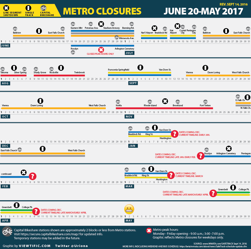
This is a picture of my son’s ball of yarn. A bad listicle is like a knotted ball of yarn… sometimes there’s a lot of untangling to do to get to the facts.

a bad listicle is like a knotted ball of yarn

I remember the day a managing editor uttered the word “listicle.” I giggled and was torn between a Beavis and Butthead snort and a disgusted of-course-only-a-guy-would-say-that reaction.

Shortly thereafter, I designed my first one (the effects of the recession on Wisconsin, if you’re curious). It was actually a charticle because it had pictures (The American Journalism Review doesn’t like charticles. I suspect they like listicles even less.)

Wired recently wrote in defense of listicles. It is reassuring to find out that listicles won’t, in fact, give you ADHD. The Guardian is more tongue-in-cheek skeptical, but kindly proffers a few literary examples to redeem the form. I think they lay it on a little thick in number 7 but it’s a good read. More seriously, the trend spawned a new genre, the apocalypsticle, roundly lambasted by Politico a few months ago as “dumbing up” the tragedy of Ukraine.

I won’t go into our obsession with lists. People like them, and you already know why they do. I confess that I’ve never been successful at writing a listicle. I’m too wordy. I rebel at the constraints of a finite number. I just can’t get the thing to hang together to my satisfaction. I need paragraphs to do that. So perhaps I’m just a little jealous.

But I am concerned that our collective obsession and fascination with the genre is not making us stupider, per se, but that—coupled with our penchant for so-called data nuggets—it is becoming too acceptable for journalists and others to conjure up a type of content that does not always responsibly use data and facts to support a story.

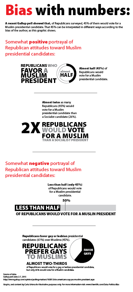
Listicles: If you’re going to compare apples to bicycles, go ahead. But don’t pretend you’re just comparing apples.

My biggest beef with the quick comparisons use in listicles is that they make it too easy to cherry-pick disparate data points and thread them together into a seemingly logical order to support a seemingly logical claim. They don’t always use logical comparisons. You’ll frequently see different periods in time compared against each other, or slightly different variables compared as well. If you don’t look closely, you can get the wrong message. And if you do look closely, you’ll be confused. It’s okay to compare things from different time periods, but you need to explain that. You also need to explain which things change from one comparison point to another.

The order in which points are presented in a list can also hide unfeasible comparisons.

If I tell you that, in 2010, 1 million green widgets were produced in the U.S., compared to 5 million red ones produced in 2012, you might think this is a ridiculous comparison and you’d be hard-pressed to understand what, if any, trend existed here. The time period is different, as is the variable.

But what if I separate those comparisons with other items in a list? You might lose track.

1.  In 2010, 1 million green widgets were produced in the U.S.

2. In 2014, China is the largest manufacturer of widgets, with the U.S. ranked at number 5.

3. Over the past 5 years In the U.S., the majority of widgets have been produced in the South.

4. Nationally, widget manufacturing plants are closing down.

5. In 2012, there were only 5 million red widgets produced in the U.S.

Now think back to how often you have come across this in a list.

Lists should offer data in order to provide perspective and context

Too many lists and listicles are simply a series of disparate data points that offer the reader no meaningful way to compare numbers with broader context.

If I tell you that there are “x” number of people living in dire poverty in the United States, I owe you a bit more than that.

I need to tell you what percentage that number is out of the broader population, and I need to define that population. I need to tell you what “dire” means. Better, I should give you a dollar amount of poverty (and cite that definition to a credible source) so that you’ll understand the context. I should probably give you the time period for this data. And in a second bullet, it would be helpful if I further provided information about change in this figure over time–preferably a long period of time to discount variances over shorter amounts of time. Here’s a better way to accomplish the first bullet:

Of the [#] million adults* living in the U.S. in 2013, [#] of them (x %) are living at or below 50% of the federal poverty level (an annual income of $5,835 for one person**)

*Adults aged 18-and older
**Federal poverty levels 2014
Citation for data source

The examples above are just that, examples. But the other day I stumbled across Mother Jones’ “10 Poverty Myths, Busted,” It proves my point. I took the time to deconstruct it below.

Not every set of facts lends itself to a list, or a conclusion.

Before you read further, please understand that my notes below are not to undermine the claim of the author, but rather to strengthen it. The notes are not intended to be exhaustive. Reasonable minds can poke holes in them at will. But my point remains the same: We have lists. We have data. We have people very willing to read them and share them. If we have strong facts that actually relate to one another, and we lay those facts out clearly and in a logical order, the reader will draw logical conclusions. But if we don’t do these things, at best, we lead readers down a rabbit hole that leaves them frustrated and confused.

At worst, we turn facts into opinions that are interpreted as facts.

Deconstructing “10 Poverty Myths, Busted,” by Mother Jones

The main problem with this list is the disparate, unconnected (by time, logic, data set) nature of 10 claims that, together, attempt to combat poverty stereotypes. The Mother Jones listicle and its bullets are in bold followed by italics. The text prefaced by “issue” is mine.

1. Single moms are the problem. Only 9 percent of low-income, urban moms have been single throughout their child’s first five years. Thirty-five percent were married to, or in a relationship with, the child’s father for that entire time.*

Issue: To me, this bullet appears to cherry-pick the data. What makes the first 5 years a magic number? What about the first 10, 15 or 18? If there is importance to those first 5 years, context would be helpful.

Issue: It is unclear whether the dads in the relationships are actually living in the household. This matters because whether or not a dad lives in a household affects the income level of the mom and child. If he lives in the household for example, the household income can be higher (if he has an income to contribute), which can affect a mom’s low-income status.

2. Absent dads are the problem. Sixty percent of low-income dads see at least one of their children daily. Another 16 percent see their children weekly.*

Issue: There is a difference between low-income and poverty. The label “low-income” is subjective. The label “poverty” is qualitative (there is a federal poverty level). So if you use a subjective level like “low-income” and don’t define it upfront, you can give the appearance of anything you like, really.

Also note how this bullet is worded. On the flip side, you could also say that a quarter of kids don’t see their dad as often as once a week.

And notice how bullet #1 discusses dads living in the household (presumably), whereas this item discusses dads who live outside of the household.

3. Black dads are the problem. Among men who don’t live with their children, black fathers are more likely than white or Hispanic dads to have a daily presence in their kids’ lives.

Problem: Cherry-picking again. Why single out black dads in this one bullet? There are Hispanic dads who live at or below the poverty level. Ditto white dads. Did MJ simply pick the most appealing (higher) number to make the point stronger?

4. Poor people are lazy. In 2004, there was at least one adult with a job in 60 percent of families on food stamps that had both kids and a nondisabled, working-age adult.

Issue: The time period shifts for these comparisons, making it impossible to compare or understand trends. This bullet dates to 2004. Others (bullets 5 and 6, for example) date to 2012.

5. If you’re not officially poor, you’re doing okay. The federal poverty line for a family of two parents and two children in 2012 was $23,283. Basic needs cost at least twice that in 615 of America’s cities and regions.

Issue: The Economic Policy Institute calculator and date from which this bullet is derived is for 2013. The federal poverty level cited is for 2012. Not a huge deal, but you can expect the numbers to change in a year due to inflation, cost of living, etc.

6. Go to college, get out of poverty. In 2012, about 1.1 million people who made less than $25,000 a year, worked full time, and were heads of household had a bachelor’s degree.**

Issue: Context would be helpful here. 1.1 million people out of how many? And isn’t it expected for new college grads to not make much money? How long have these 1.1 million people cited been in the workforce? Poverty is unacceptable at any level (my opinion here), but telling me that a forty-year-old mother of two with a degree who has been in the workforce for 20 years and is living at the federal poverty level is one thing. Tell me the same thing for a recent grad out of school for a year will send me a different message.

7. We’re winning the war on poverty. The number of households with children living on less than $2 a day per person has grown 160 percent since 1996, to 1.65 million families in 2011.

Issue: This myth is so subjective and vague that it’s hard to dissect. It would be helpful to know if the $2 a day includes or does not include federal assistance (TANF, SNAP, etc.).

8. The days of old ladies eating cat food are over. The share of elderly single women living in extreme poverty jumped 31 percent from 2011 to 2012.

Issue: Clearly, this lacks context to be clear and helpful. What does extreme poverty mean? If you dig into the source report for this, you’ll see on page 3 that extreme poverty is defined as income at or below the federal poverty level. The statistic itself is startling and would be strengthened by an upfront definition of the spectrum of poverty, preferably in dollar figures as well.

9. The homeless are drunk street people. One in 45 kids in the United States experiences homelessness each year. In New York City alone, 22,000 children are homeless.

Issue: To put this into perspective, What is the percentage of homeless kids compared to the percentage of homeless adults with (presumably) addiction problems? The connection between homeless individuals with substance abuse issues and children may be one that is widely discussed, but in terms of statistical comparison here, the pairing is clunky.

10. Handouts are bankrupting us.In 2012, total welfare funding was 0.47 percent of the federal budget.

Issue: It’s difficult to follow the citation, partly due to how you define “2012” and “federal budget.” If you follow the citation, you’ll see that this bullet cites the budget that the president proposed for FY2013 on February 13, 2012 ($3.8 trillion). The key word is “proposed,” and the fact that the budget itself was for FY2013. This was not the 2012 budget, as the wording in this bullet implies. Further, the FY2013 budget itself is hard to pin down. The bullet implies that spending happened as a proportion of an actual budget. But in reality, it’s citing a 2012 figure ($16.6 billion) as a percentage of a proposed budget for a different year (2013), not the actual budget for 2012. Furthermore, remember that the proposed budget is simply a draft, if you will. It must be approved by Congress (remember all the subsequent political wrangling, counter-proposals by Republicans, sequestration, etc. (If you want to know what happened to the 2013 budget however, you can check out CBO’s later analysis.) So saying that total welfare funding in 2012 “was” a percent of a **proposed** budget that was intended for FY2013 is neither correct, nor easy to follow.

Issue: Then there’s how “welfare” is used in the bullet. It’s unclear what that means. Clarifying it upfront would have been more helpful. Presumably the word “welfare” is the $16.5 billion cited by the Center on Budget and Policy Priorities for what is known as TANF (Temporary Assistance for Needy Families – financial aid for some poor families). But you have to do a little digging in the source to ascertain that. And using the word “welfare” could mean TANF, and it could mean SNAP (food stamps) as well. Or something else, as this helpful post on Real Clear Politics points out. This is needlessly unclear, given that the term “welfare” is such a politically charged word.

Sources as cited in the above Mother Jones list:
*Source: Analysis by Dr. Laura Tach at Cornell University.
**Source: Census

So, listicles. Use them wisely and well. And if not, stick to the goofy stuff, not the serious stuff. Like, top 6 reasons this post would have been shorter and more effective if I had used a list.

Mind the gap: Advocacy journalism fills a void

March 30, 2014By carlainformation, interactives, news

By now, it’s safe to say that the digital ecosystem is shaking things up for journalists. Traditional journalists are turning into brands (Ezra Klein, Vox and Nate Silver, 538, to name a few). Journalists are getting paid for clicks. Social media tools are creating a new breed of reporting through conflict journalism and citizen journalists—coverage that bleeds into news reporting and advocacy. And mission-driven social media sites (like Upworthy) are partnering with advocacy organizations to create serious, in-depth original content, as the Nieman Journalism Lab reported last month. Phew.

Mind the gap: Advocacy journalism fills a void

And now advocacy organizations are getting into the mix. They’re taking the reins by exposing, researching and writing about the issues they care about in a genre of journalism known as advocacy journalism. Advocacy journalism has been around for a while (remember muckraking?). But today’s digital landscape seems ripe for innovation by those that want to take the genre further.

A recent article by Dan Gillmor in Slate’s Future tense project provides a thought-provoking and current look at the nexus of advocacy and journalism today, one that made me want to dig a little deeper into the subject to see where the field is at and what hurdles it faces.

Advocacy journalism is an interesting genre. On the one hand, it seems like a big deal—by injecting a point of view, it appears, at first blush, to upend the sacrosanct “objective reporting” model that is the foundation of traditional journalism. But in fact, today’s so-called traditional journalism is itself rife with points of view (reporters are human, after all, and routinely bring their personal perspectives to the questions they ask and the subjects they cover).

It’s no coincidence that, at the same time as advocacy journalism is getting more attention, investigative reporting in traditional media—the bread and butter of deep, immersive journalism—is diminishing due to shrinking newsroom budgets, capacity, and interest. (The American Journalism Review wrote about it in 2010, and things don’t look that much rosier if you read about revenues and ad dollars in Pew Research Center’s State of the News Media, 2014 report or the internet marketing firm Vocus’s 2014 State of the Media.)

So, resources for investigative reporting in traditional media may be diminishing, but the need itself certainly hasn’t. The immediacy of the internet and social media reporting make the gaps left by traditional news organizations more transparent than ever before. It has opened up the playing field for those who want, and need, to write about social change, and see advocacy journalism as yet another tool for driving that change. It is here that advocacy organizations are stepping in.

Gillmor mentions the Upworthy partnership with Human Rights Watch, Climate Nexus and ProPublica, but he also reminds us of the work of the libertarian Cato Institute, and the ACLU, noting that these organizations are not just writing about their issues—they have invested in hiring talented, investigative journalists to do the work.

One of my earlier posts this year discusses how advocacy organizations are harnessing social media to effect social change on their own terms (I wrote about the MIT Center for Civic Media’s study of the media coverage of the Travyon Martin tragedy, and of how it was framed and defined in part by digital-savvy advocacy organizations). In the same way, advocacy organizations are equipping themselves with investigative journalists to define the things that need fixing in our society, again, on their own terms.

Transparency and bias concerns apply to all reporting, not just advocacy journalism

As with any form of journalism (see a post that I wrote about the importance of trusted messengers correctly reporting the facts), there are always legitimate concerns around the ability of the “reporter” to be transparent about the perspective and bias that he or she brings to a story, especially when money comes into the picture (for example, a journalist embedded in an advocacy organization writing about an issue that is driven by a funder). But one can easily make the argument that journalism has never been immune to this predicament. Media brands are, after all, owned by corporations—remember Michael Bloomberg’s takeover of his newsroom and Murdoch’s editorial biases? The issue is not so much that money is paying for journalism (it always has). Rather, the issue is one of transparency and fairness (something Gillmor acknowledges in his online book, Mediactive).

Most recently, advocacy journalism was roundly dismissed by Buzzfeed’s Editor-in-Chief Ben Smith. When Eric Hippeau, a venture capitalist (and early investor in Buzzfeed), sat on a panel at the Columbia School of Journalism and asked Smith about the fine line between different forms of journalism and advocacy, Smith responded, “Um, yeah, I hate advocacy. Partly because I think, you know, telling people to be outraged about something is the least useful thing in the world.” (The video is here and and a good article with more on Buzzfeed is here.)

That’s kind of ironic given Buzzfeed’s public missteps and its association with the Koch brothers on the issue of immigration reform. I’m not saying that the partnership is in and of itself a concern (Slate’s Dave Weigel described it as a “pro-immigration reform” panel that was very much in keeping with the Koch brothers’ longstanding interest in the issue). But the association is not one to be ignored, either, particularly from a man who claims to hate advocacy. I’m still coming around to the idea that “Buzzfeed” and “journalism” can be conjoined. I don’t say that to be snarky—I say that to mean that all lines are blurring, including newstainment sites like Buzzfeed that are reinventing themselves in the digital journalism mold, whatever that is.

Medialens has a good take on the back-and-forth skepticism around advocacy journalism (“All Journalism is ‘Advocacy Journalism’ “) and offers some clear-eyed perspective by pointing to numerous examples of how ‘non’ advocacy journalism exhibits bias (ranging from uber-left Ira Glass’s omission of the U.S. role in Guatemalan genocide to Jeff Bezos’s 2013 purchase of the Washington Post alongside Amazon’s $600 million cloud-computing deal with the CIA—on the heels of its decision to stop hosting WikiLeaks in 2010).

Journalism is changing: traditional media gatekeepers are going away

As Gillmor points out (and as I’ve written written previously), back in the day, traditional media were largely gatekeepers to reporting. If you were an advocate or an organization with a story and a point of view, you had to get a reporter’s interest and rely on that person to pitch it to an editor. To stand the best chance of success, you had to do the research, get the facts straight, frame the narrative, and package it up so that a reporter could understand it, pick it up, and pitch it. Those days are disappearing, and in their place is a new frontier of blurry gray lines of people and perspectives, all vying for a chance to shape the news agenda of the next hour. Investigative reporting is what gives all of us perspective, makes us take a collective deep breath, and think beyond that next hour.

It’s unsettling, but also an opportunity to fill in the gaps left by the old guard, as long we do it right. So, what’s right?

Doing it right: some things should never change

I recall reading (and tweeting) about Upworthy’s announcement when I read Nieman Lab’s post last month. Given that I work in a policy and advocacy organization that has a keen interest in seeing its point of view accurately and widely expressed in the media, I myself wondered how we could inject ourselves into a similar partnership. And, if we could, what we would say, how we would separate our social passion from the hard and complicated truths that spell out complex political realities? For me, it raised more questions than I could answer. But it’s tremendously exciting to see where others are going.

I’ll be curious to see how (or if) these partnerships help fill the void left by the diminished investment in investigative reporting in traditional newsrooms. And I’m also eager to see what new best practices emerge as a result. But regardless of how things change, the responsibility of transparency has never been greater. And all of these changes add up to the same principles that should never, ever change in journalism—report the facts, be clear and transparent about your point of view, and tell people where your money is coming from.

Dataviz is not a one-way street: fostering critical thinkers

March 3, 2014By carlainformation, interactives

Last year, I wrote two posts about the important editorial role that the designer plays in visualizing data (you can read them here and here). This week, Moritz Stefaner did a much more eloquent (and concise) job of underscoring the sensibility and the responsibility of the designer in crafting a data visualization.

But what I found particularly insightful about Mr. Stefaner’s post is his different characterization of what many of us (including me) typically describe as “telling the story” through data. He challenges that oft-used paradigm and, instead, offers a more compelling mode–the participatory, audience-driven cognitive experience that is the true power of data visualization. To me, this is what I found the most compelling, the power that data visualizations have to create a community of critical thinkers.

The story-telling model, according to Mr. Stefaner, is a one-way street that invokes a limiting, linear “start here, end here” dynamic–one that ignores the true opportunities that data visualization presents. Mr. Stefaner’s more aspirational definition has the reader exploring and creating his/her own experiences through the visualization.

In hindsight, it makes so much sense, right? It’s the interactivity of data visualization beyond sorting, filtering, reading and reporting. Rather, it’s a way to respect and foster the intellectual curiosity of the reader, thus fostering a culture of critical thinkers who go behind the more passive consumption of being “told” a story.

Mr. Stefaner tells us that this is his motivation for creating rich, immersive projects, ones that turn his audiences into “fellow travelers,” as he calls them. I absolutely love this characterization, albeit to me, it is not without some challenges. For example, there are times when I find myself lost in a data visualization that is too complex. Rather than stimulate my intellectual curiosity and propel me deeper into that visualization, I find myself frustrated that I’m being left behind by the author/designer, that I’m missing something important. This isn’t what Mr. Stefaner is suggesting, but it’s worth noting nonetheless.

This is one of the best things that I’ve read in a while, and one I’ll remember.